Logo design is an important part of any branding strategy. It is the visual representation of a business or organization and can help to create recognition for your brand and make it stand out from competitors. When creating a logo, it’s essential to understand the principles of logo design in order to produce an effective visual that will have a lasting impact on viewers. To help you design a logo that will have lasting appeal, here are 7 principles of logo design that can make all the difference.
Simple and Memorable
Creating a logo for your business or organization requires careful consideration and thought. An effective logo should be simple yet memorable, and able to communicate your values to the public in an instant. The most successful logos are those that are both timeless and modern. It should be visually appealing and inspire confidence in viewers, while also representing the mission of your company or organization. Keep it simple – too many elements can make a logo look cluttered and confusing. Striking colors and bold fonts will help to ensure that your logo stands out from the crowd. Additionally, use an appropriate size so people can easily recognize it no matter where it is seen – from billboards to menus to smartphone screens.
The Nike logo, which features the iconic “swoosh” symbol, is one of the most recognizable logos in the world. It is a simple and memorable design that conveys the company’s message
Versatile
 The world of logo design is complex, but the principles behind it remain surprisingly simple. Versatility is one such principle that can make or break a logo – if designed correctly, it can create an eye-catching and memorable symbol for any business.
Versatile logos should be able to stand out on their own as well as when accompanied by other elements. Depending on the product or service being represented, a versatile logo should be able to appear equally effective in both 2D and 3D form, while still maintaining its core components regardless of size or color changes. Furthermore, any good versatile logo must work across all media – from billboards to social media banners – without compromising its effectiveness or meaning.
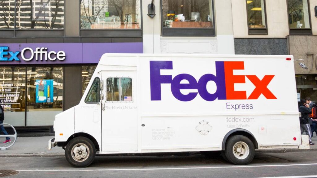
The Fedex logo is used across a variety of mediums, from digital ads to physical delivery trucks. The logo is designed to be versatile, allowing it to be used in a variety of contexts.
Relevant to Brand
 A good logo should be memorable, recognizable, and relevant to the brand it represents. Choose a color scheme that fits your brand’s personality and use shapes or lines that will stand out from other logos in your industry. An overly complicated or busy logo will not be as attention-grabbing as one which has fewer elements but stands out more clearly.
The Burger King logo is a stylized depiction of a hamburger with the company’s name written in a distinctive font. This logo is used across all of Burger King’s marketing materials and is easily recognizable
Unique
 The world of graphic design is full of visual styles, symbols, and messages that help create an identity and communicate a message. When it comes to logo design, the challenge is even greater – creating something unique to represent a business or organization. While there are no hard and fast rules for designing logos, there are some key principles to keep in mind when crafting a memorable logo. When looking at good logo designs, it’s important to consider how cleverly each element has been used together – from color palette selection to font style – all working together harmoniously to produce a professional-looking result. It’s also essential that your logo is timeless; meaning it should still be relevant years down the line without needing major updates or redesigns.
The Apple logo is one of the most recognizable logos in the world because of its uniqueness and simplicity. It consists of an apple with a bite taken out, and the colors are a simple black and white. This simple, yet effective
Appropriate for the Intended Audience
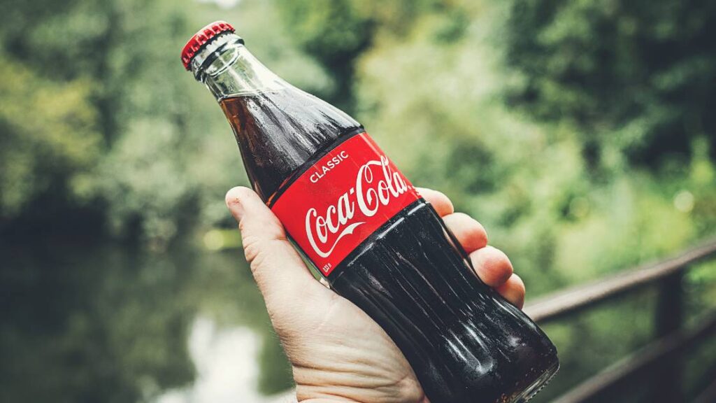 It’s important to consider who your target audience is when creating a logo. According to experts in design, a successful logo should reflect its brand’s values and personality as well as being aesthetically pleasing. A logo meant for young people should be energetic and vibrant while an older demographic will likely appreciate subtle sophistication. Additionally, pay attention to the type of font used: simple fonts tend to be more easily recognizable than complex ones. For example, the Coca-cola logo is a simple wordmark that is relevant to the brand and the product.
Coca-Cola’s iconic red and white logo is easily recognizable among children and adults alike. The logo is simple, yet memorable, which makes it easy for the intended audience to identify with the brand.
Timeless
 It is essential to design a logo that has timeless appeal and stands out from competitors. Simplicity is key when creating a timeless logo – as with all design projects – because overly complicated logos can be difficult for audiences to understand. Additionally, complex designs may date over time if they don’t keep up with changing trends; therefore it’s important to ensure that your logo uses simple shapes and colors for maximum impact.
McDonald’s iconic golden arches logo has been in use since 1968 and is still instantly recognizable today, making it a timeless symbol of the brand.
Consistent Use Across Platforms
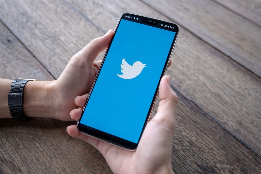 Your logo should look the same in print as it does on your website, and it should also stand out on different types of media. You want your logo to convey an immediate message and make a memorable impact on potential customers or clients. Additionally, your brand’s color palette and fonts should remain consistent across all platforms as well. This will help promote recognition for any content associated with your brand. In addition to creating a unique visual identity, you must consider how small or large the size of your logo can be adjusted for each platform without losing its readability or clarity.
The twitter logo is used consistently across all platforms, from web to mobile to desktop. For example, the logo appears in the same blue and white colors, with the same font and design on the app
Conclusion:
A well-designed logo should have an element of timelessness, as logos often last for years or even decades. Additionally, it’s important to consider how well a logo can be used across multiple platforms – such as print media, online media, TV commercials and more. Ultimately, with careful consideration given to these principles before starting work on any logo design project, you can ensure your finished product will be unique and effective in promoting your business’s brand identity.
Stop worrying about struggling to design your own company logo; unlock your business’s potential with us. Our innovative logo design services use targeted industry knowledge and cutting-edge technology to ensure that you have a unique, professional logo that truly reflects your values and vision. Don’t wait any longer – contact us today for a free consultation and let us transform your company’s branding!


