Great logos have a timeless quality to them, embedding themselves into our cultural consciousness and sticking with us long after we first encounter the brand. Some logos are so iconic that they seem to gain a life of their own, representing the company or product they were designed for in a very visual and compelling way.
Creating a logo that achieves this level of memorability and recognition is both an art and a science. There are certain elements that contribute to making logos memorable and effective brands in visual form.
Here are the key elements that define a successful, memorable logo:
Simplicity:
 The most memorable logos are simple, clean, and uncluttered. Some of the most well-known logos in the world are extremely simple, like the Nike swoosh, the Apple apple, and the Target bullseye. Simple logos are easier to recognize and remember. They also scale well, maintaining their impact whether small or large.
Visual Imagery:
Logos that incorporate visual imagery, especially familiar and meaningful imagery, tend to be very memorable. For example, the Apple logo depicts an apple, visually representing the brand name. The Starbucks siren logo contains memorable mermaid imagery. Visual imagery gives these logos extra staying power in our minds.
Symbolism:
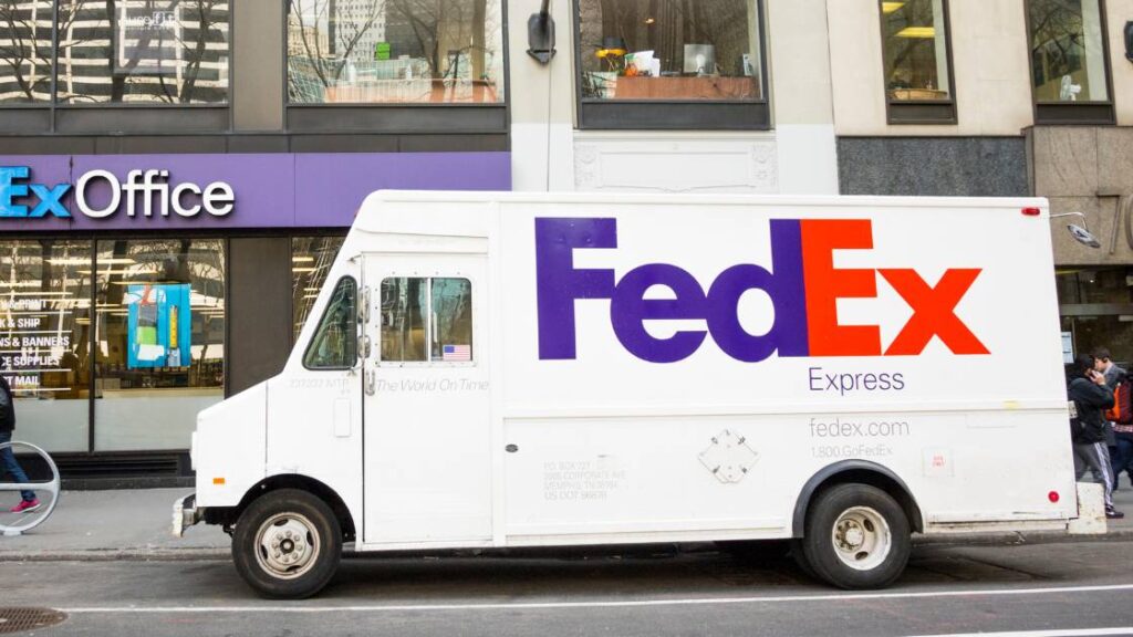 Memorable logos often go beyond just visuals and incorporate symbolism. The Nike swoosh is meant to represent speed, motion and athleticism. The Target bullseye is a symbol for their “customer-centric” focus. FedEx’s logo subtly incorporates an arrow pointing forward in the space between the “E” and “X,” signifying transportation and speed. These extra layers of meaning make a logo more impactful.
Proportion:
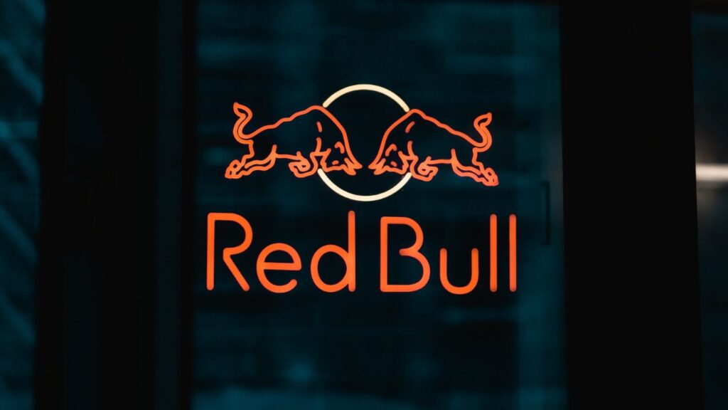 Proportion refers to the relative size and placement of elements in a logo. Memorability is achieved when a logo’s proportions feel balanced, symmetrical, and “just right.” Logos that violate proportion tend to not make as strong an impression.
Color:
 Color is one of the most important elements of any logo. Vibrant colors that reflect a brand’s personality are essential. Memorable logos like Coca-Cola, IBM, and Ferrari would simply not have the same effect in dull, drab colors. However, limiting the color palette to just two or three complementary colors is best.
Typography:
Distinctive, customized typography is what gives many logos that polished, memorable quality. Think of the Walt Disney logo, with its hand-drawn lettering, or the Coca-Cola logo in its recognizable Spencerian script. Memorable logos achieve the ideal balance of distinctiveness and legibility when it comes to typography.
 Consistency:
Memorable logos remain largely consistent with perhaps only minor changes over long periods of time. Coca-Cola’s script logo has remained almost entirely unchanged for over 100 years. Too many changes and variations dilute the impact and memorability of a logo. Memorable logos stand the test of time.
In summary, simplicity, meaningful visuals, symbolism, proportion, vibrant colors, unique typography, and consistency over time are the hallmarks of a memorable logo. When all of these elements come together harmoniously, the result is an instantly recognizable brand identity.


