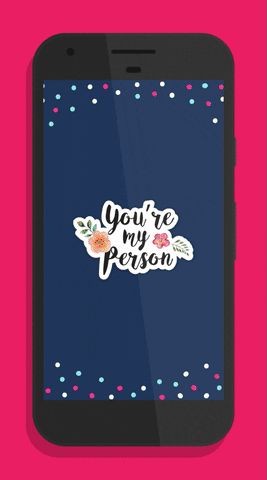
Today we are living in a world where most of the activities are carried on digitally. You may have noticed that visual communication is very effective and result-oriented nowadays. Graphic designing is an online tool that enables the communication of messages visually. It saves time and is widely preferred by the public at large. Let it be any design, for example, layout, packaging, logo, illustration, web design, and many more are all possible through graphic designing software. You must have heard about photoshop. This is also a part of graphic design. Photoshop is a creative part of graphic designing rather than analytical. To become a professional photoshop designer, it is better to practice on tablets for photoshop.
Not only communication but excellent graphic designs build trust, increase sales and strengthen your position in the market. Some professionals are experts in making such designs. But do you know that graphic designing can also be done at home? For that, you need to know the basics of graphic designing. Do not assume that graphic designing at home will not give professional effects. Because, if you have a proper base of graphic designing, it will become easy for you. And no one can differentiate between a newbie and a professional graphic designer.
Do you follow the readymade templates for designing purposes? Still, you must remain well informed of the below-mentioned basic principles of graphic designing. Because you need to customize an existing design to avoid copyright issues.
At the very initial point, need to know about the 5 basic principles of graphic designing:
1.Proximity: The graphic designs we see are originally grouping several elements that help to see the images and read the information in a single design. So proximity is nothing but assembling several parts of the message in one place. Proximity offers unity to scattered elements of a message.
2.Alignment: Alignment is necessary to improve the visuality and readability of any design. Nobody would like to see a distorted design. Because it feels disturbed if there is no connection between text, images, and shape in the graphic designs. Start with a proper alignment and also check alignment after finishing the design. Remove the remaining distortion by aligning it properly.
3.Hierarchy: The message you want to convey must be highlighted to drive customer focus. It can be any visual or text. You can either fill it with colors or put it inside a particular shape. Allow your message to dominate over other elements of graphic design. For example, you want to drive the attention of people towards the title, then make the size of the title large and bold compared to others.
4.Rhythm: It means to maintain a consistent flow in the message. It can be achieved by repeating logos or colors. It also enhances the overall look of the message and promotes your brand visibility.
Two types of rhythm:
- Fluid: Flow of message in a particular direction with enormous variation in the design.
- Progressive: Your target audience can concentrate on different elements with the help of a clear sequence.
5.Contrast: It means something opposite to others. In the case of any visual art, contrast helps to draw attention to the key elements of your design. It is recommended to maintain differences between the same elements of any design. Contrast is required to boost up the overall legibility of the layout of your design. To create contrast, remember to place the design elements opposite on a layout. Large and small, thick and thin, dark and light, and so on are some examples of contrast.
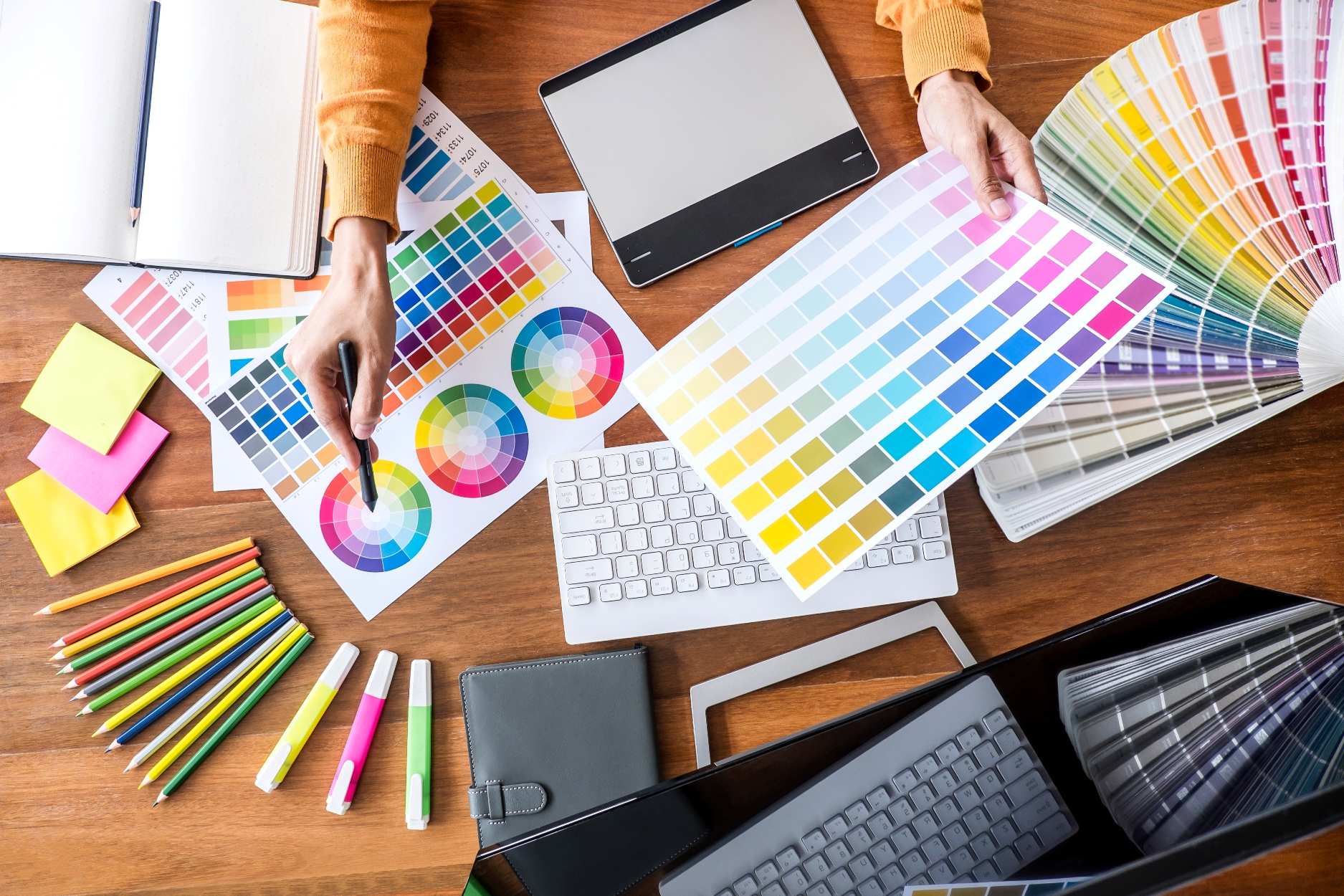
Well, these are the five basic mantras to start with graphic designing. Other than these, you must be aware of other principles of graphic designing like balance, color, and space. The choice of a certain layout for proper distribution of design elements like text boxes, shapes, and images is the characteristic of the balance property. It is of three types: Symmetrical, Asymmetrical, and Radial. Symmetrical one stands for even distribution of elements on both sides of a layout. Asymmetrical means similar elements on both sides of a webpage but the sides differ in respect of color, contrast, and scale. Radial is a dynamic design of circular pattern on the layout.
With the help of color properties, you can define the tone of the message. There is a huge variety of color combinations for the text and background of the layout from which you can choose randomly.
You may have noticed that there remains some area idle around or between several elements of a designing layout. Well, this is due to the space property of graphic designing.
So these basic principles of graphic designing can help you move forward with its advanced courses. And today graphic designers are in great demand. So these basic principles can help you understand the graphic designing courses very well.