Color psychology is the scientific study of how colors impact human behavior and emotions. While there is still much research to be done in this area, color psychology has been used in fields such as marketing and design to help create more effective and appealing products. Different colors can evoke different emotions, and understanding these effects can help businesses better target their products or services.
Certain colors have been shown to have universal effects across cultures. For example, red is often associated with danger or excitement, while blue is often seen as calming or relaxing. Green may be associated with nature or growth, while black may be seen as powerful or modern. Of course, these are not hard and fast rules, and everyone perceives colors differently. But understanding these general trends can still be helpful when trying to create a certain mood or feeling with your product.
The different colors and what they symbolize
Color plays a big role in our lives and can be used to symbolize different things. For example, the color red can symbolize love, anger, or danger. The color blue is often associated with calmness and serenity. Green is often associated with nature and relaxation. Yellow is often associated with happiness and optimism.
Colors can also be used to create different effects in branding and marketing. Famous brand examples have demonstrated the exceptional power of color to build a recognizable and much-loved brand image using the psychology behind different colors.
Red:
Color Psychology Red
Red is one of the most powerful colors in the world. It’s been shown to increase heart rate, adrenaline and energy levels. It can also create a sense of urgency and excitement. All of these qualities make red an ideal color for branding.
Red is often used to grab attention and create a sense of urgency. For example, fast food restaurants often use red in their logos and marketing materials to encourage people to eat on the go. Retailers also use red during sales and clearance events to get customers into their stores.
While red is a powerful color, it’s important to use it sparingly. Too much red can be overwhelming and stressful. When used correctly, red can be an effective way to stand out from the competition and get people’s attention.
Green:
Color Psychology Green
Green is the color of nature and is often associated with growth, fertility, and new beginnings. The color green also has a calming effect, which can be helpful in promoting relaxation and reducing stress.
In branding, green is often used to convey a sense of environmental responsibility or to promote healthy products. Green can also be used to create a feeling of tranquility, hope, and goodwill.
Blue:
Color Psychology Blue
While blue is often seen as a calming color and is associated with trustworthiness and reliability, which is why many businesses use it in their branding. Dark blue can be seen as serious and formal, while light blue is more friendly and approachable.
Blue is the color of the sky and the ocean, so it’s no surprise that it’s often associated with feelings of peace and tranquility. Blue is also a very popular color choice for bedrooms because it promotes relaxation.
Yellow:
Color Psychology Yellow
When it comes to yellow, people tend to have strong reactions. Some love it and find it cheerful, while others find it grating and difficult to look at for extended periods of time. It’s a color that can be both happy and alarming, which is why it’s often used in warning signs and cautionary messages.
On a basic level, yellow is associated with sunshine, happiness, and warmth. It’s the color of summer days and golden fields of wheat. When we see yellow, we can’t help but feel happy and optimistic.
Pink:
Color Psychology Pink
The color pink is often associated with femininity, romance, and sweetness. Pink is a very popular color in branding because it can evoke these positive emotions. However, too much pink can also be overwhelming and create a feeling of being “sickly sweet.” Too little pink can make a brand seem unapproachable or unemotional. The right shade of pink can make a brand seem approachable, friendly, and trustworthy.
Purple:
Color Psychology Purple
The color purple has been associated with royalty, power and wealth for centuries. In the past, only the wealthy could afford to wear clothing dyed in this regal hue. Today, purple is still often associated with luxury and prosperity.
Purple also has a calming effect, which can be helpful in promoting relaxation and stress relief. This makes it a popular choice for bedrooms and bathrooms. Purple can also be used to create an air of mystery and suspense in movies and TV shows.
Orange :
Color Psychology Orange
Orange is a color that is associated with energy, happiness, and excitement. It is a color that can make people feel more alert and motivated. Orange is also a color that can be associated with warmth and friendliness. Orange is a color that is often used to attract attention.
Black:
Color Psychology Black
Black is one of the most popular colors in branding and marketing. It is a color that evokes strong emotions, including power, strength, authority, and sophistication. Black also has a wide range of meanings and associations, making it a versatile color for businesses to use in their branding.
When used correctly, black can convey an air of sophistication and luxury. It is often used in high-end fashion and cosmetics branding, as well as in car advertising. Black can also be used to make a bold statement or create an impactful contrast.
However, black can also be associated with negative emotions such as sadness, anger, or fear. It is important to consider the context and audience when using black in branding or marketing materials. Overall, black is a powerful color that can evoke strong emotions and convey different messages depending on how it is used.
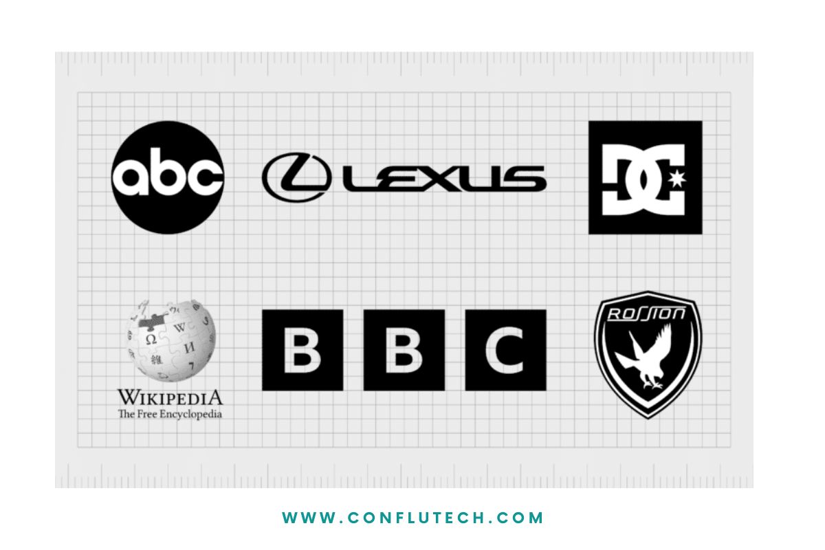
Both black and white are a great contrast when planning a logo, as they reflect the absolute ideal blend.
White:
Color Psychology White
When it comes to color psychology in branding, white is often seen as a blank canvas. This color is associated with purity, cleanliness, and neutrality. Because of these associations, white can be used to create a sense of order and calm. It can also be used to convey simplicity and minimalism.
In some cases, white can also be seen as cold or sterile. This is why it’s often used in hospitals and clinics. When using white in branding, it’s important to consider the context and the message you want to communicate.
Brown :
Color Psychology Brown
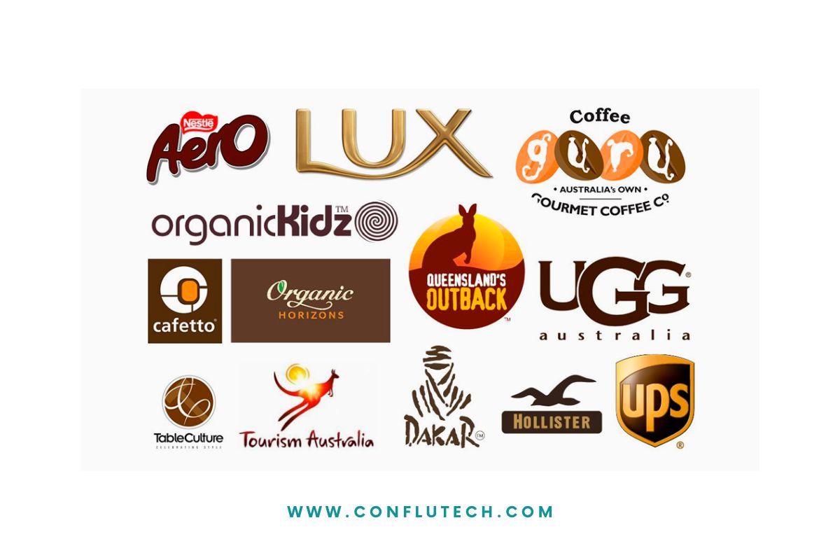
When it comes to color psychology in branding, brown is often seen as a stable and reliable color. Brown can create a sense of comfort and security, which is why it is commonly used in home decor. This earthy hue also conveys a sense of naturalness and durability.
While brown is often seen as a positive color, too much of it can make a brand seem dull or even depressing. When using brown in branding, it is important to find the right balance. Pairing brown with brighter colors can help to create a more dynamic and interesting brand.
Turquoise:

Color Psychology Turquoise
Turquoise is a color with a calming effect, which can be helpful in branding. It is associated with trustworthiness, and it is also said to stimulate creativity. This makes it a good choice for businesses that want to convey these qualities.
It’s no secret that colors can have an impact on our moods. Blue skies and sunny days tend to lift our spirits, while dark, dreary days can bring us down. But did you know that colors can also impact our perceptions?
When it comes to branding, colors are just as important as the words used to describe a product or service. The right colors can help create an emotional connection with customers and influence their perceptions of a brand.
Color psychology in branding can have a significant impact on how consumers perceive the brand. Different colors can affect people’s moods and emotions, and this can influence whether or not they make a purchase. While some colors may be associated with positive feelings, others may evoke negative emotions. Therefore, it is important for companies to carefully select the colors that they use in their branding. By understanding how colors can affect mood and perception, businesses can create more effective branding that resonates with their target audience.





One Comment